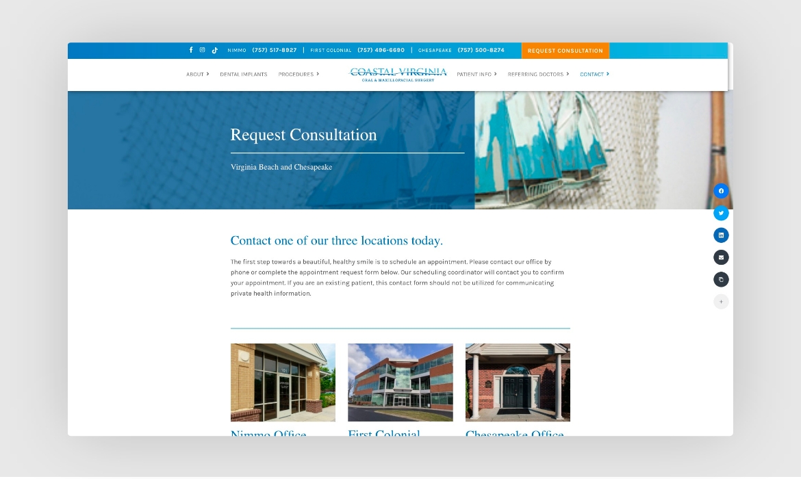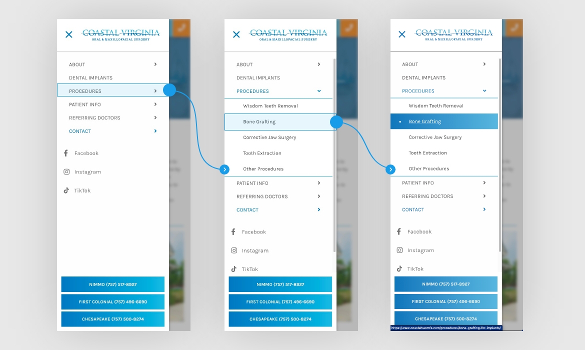
Utilizing their logo as inspiration, I wanted to bring out more of a "beachy" aesthetic that highlighted the coastline that patients of that area would be familiar with. Orange was chosen as a secondary color to provide contrast against the branded blue, bringing attention to important calls-to-action.
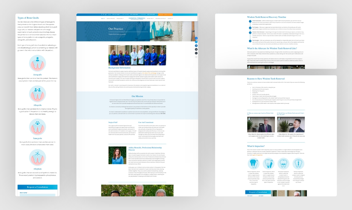
The internal pages of the website were designed with utility in mind, providing enough variation in layout to keep users interested as they read the content. A custom testimonial video library also assisted in portraying the practice as friendly and trusting.


